Visual Identity
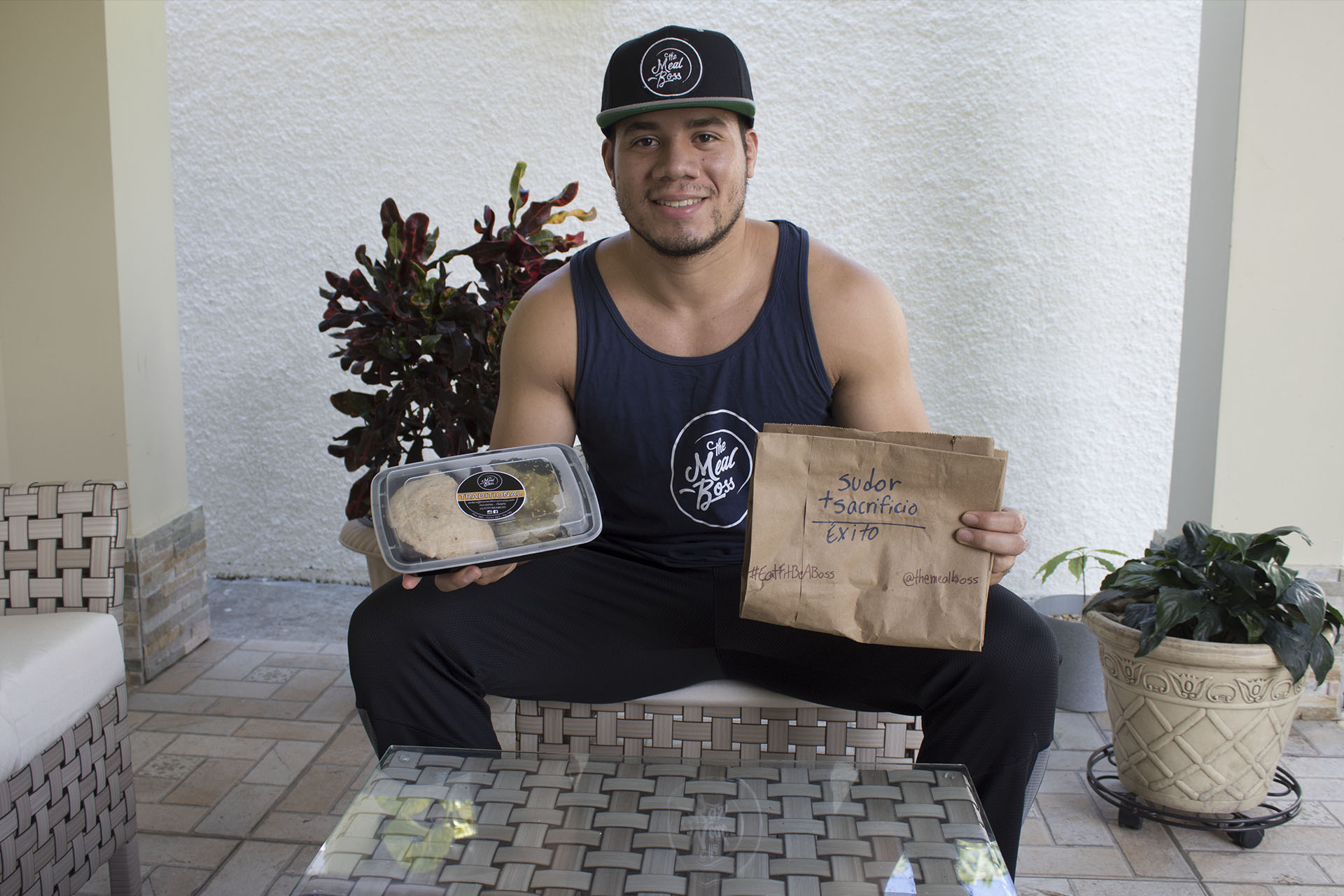
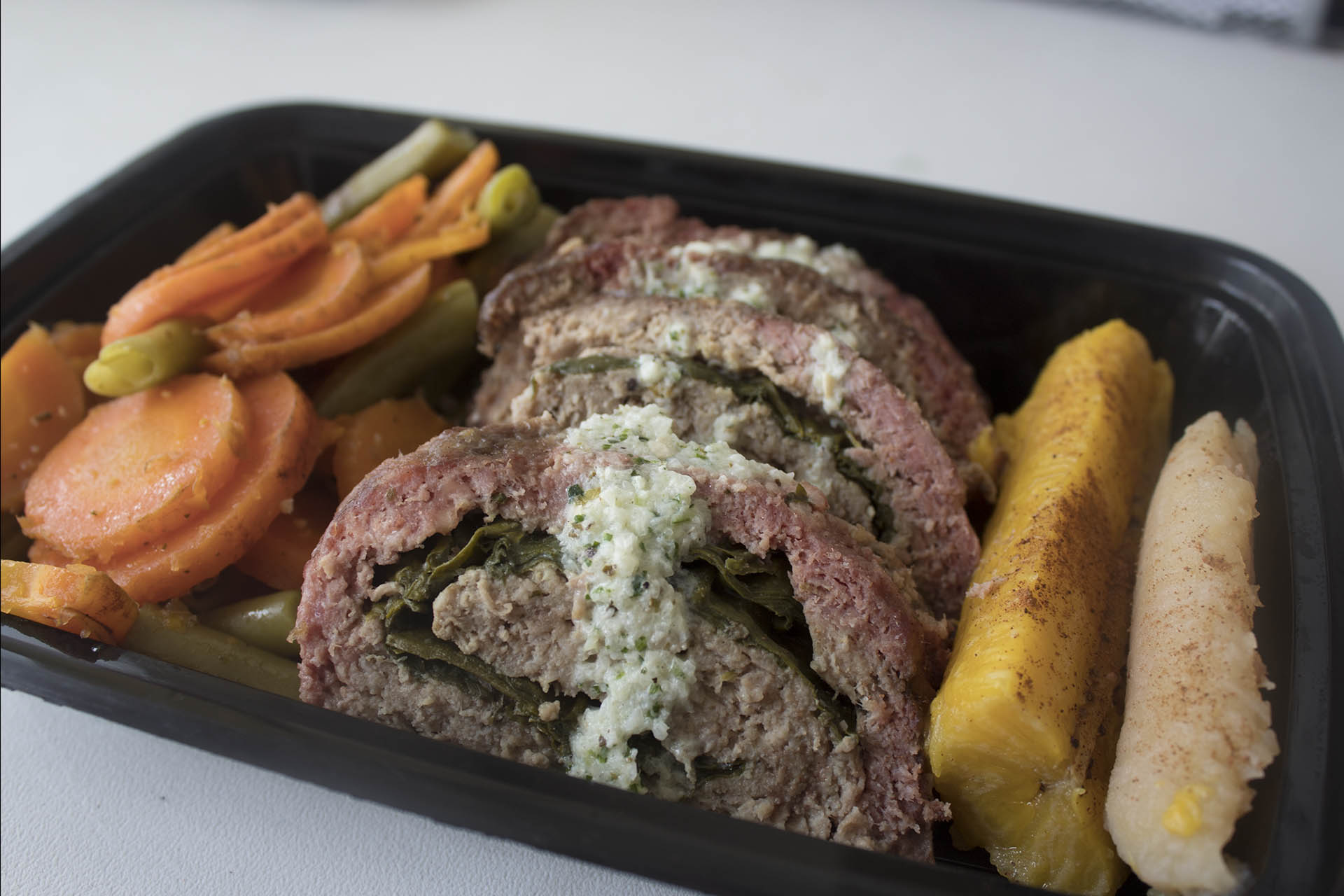
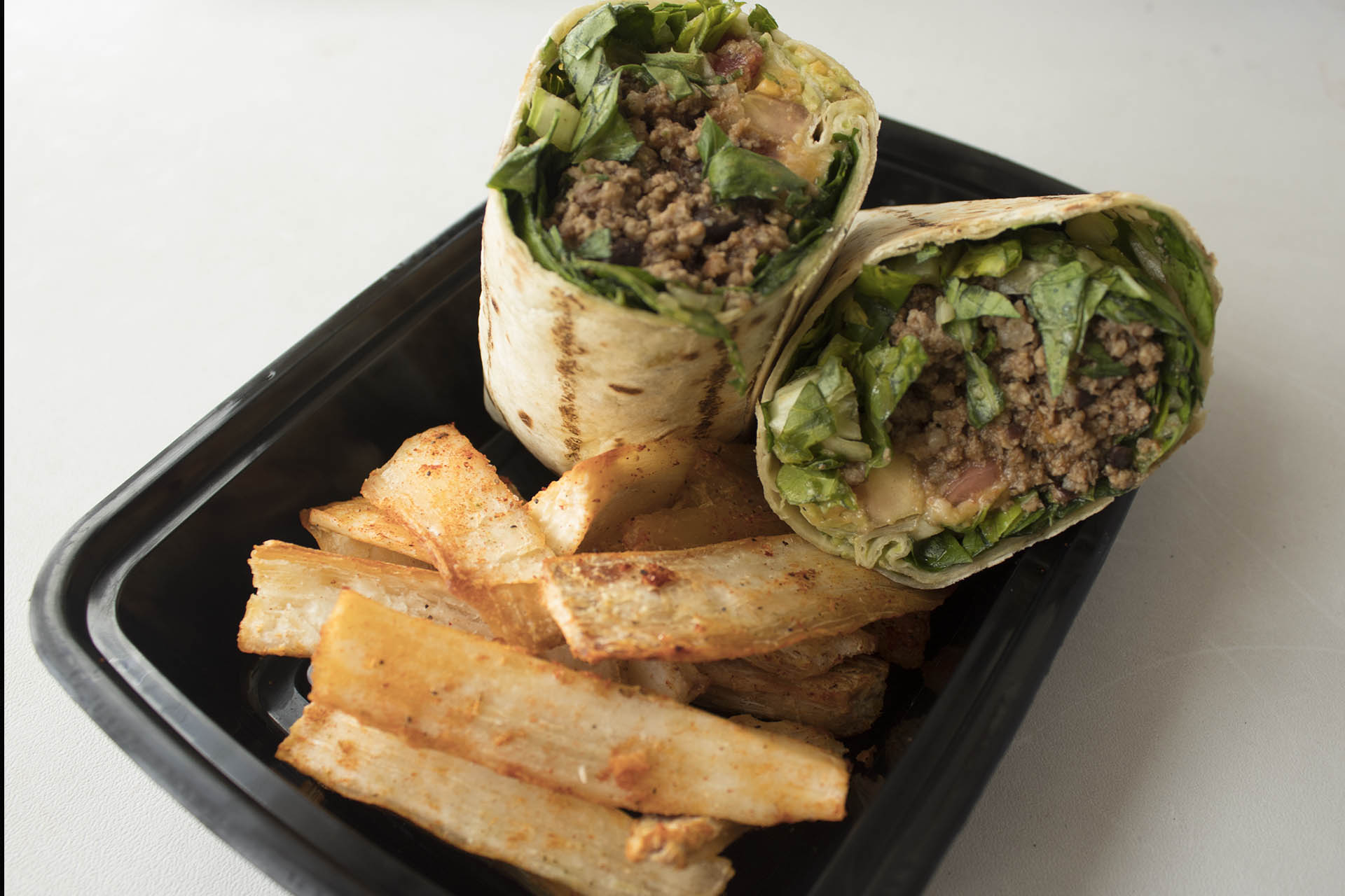
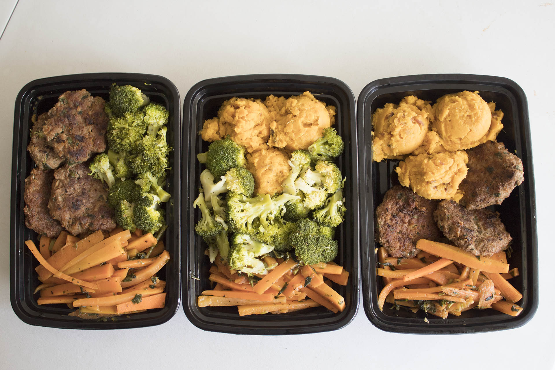
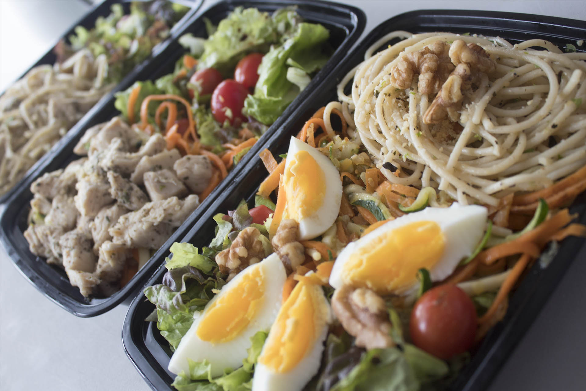
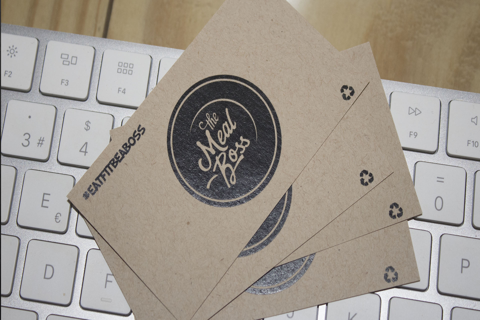
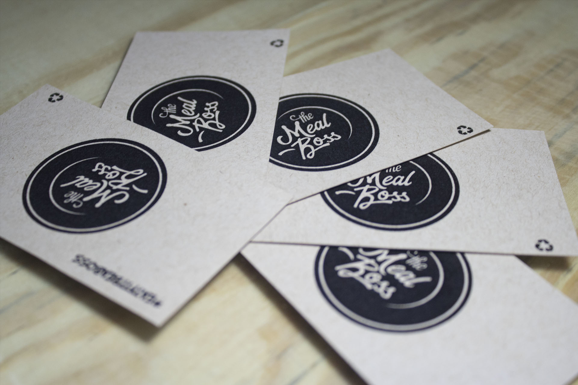
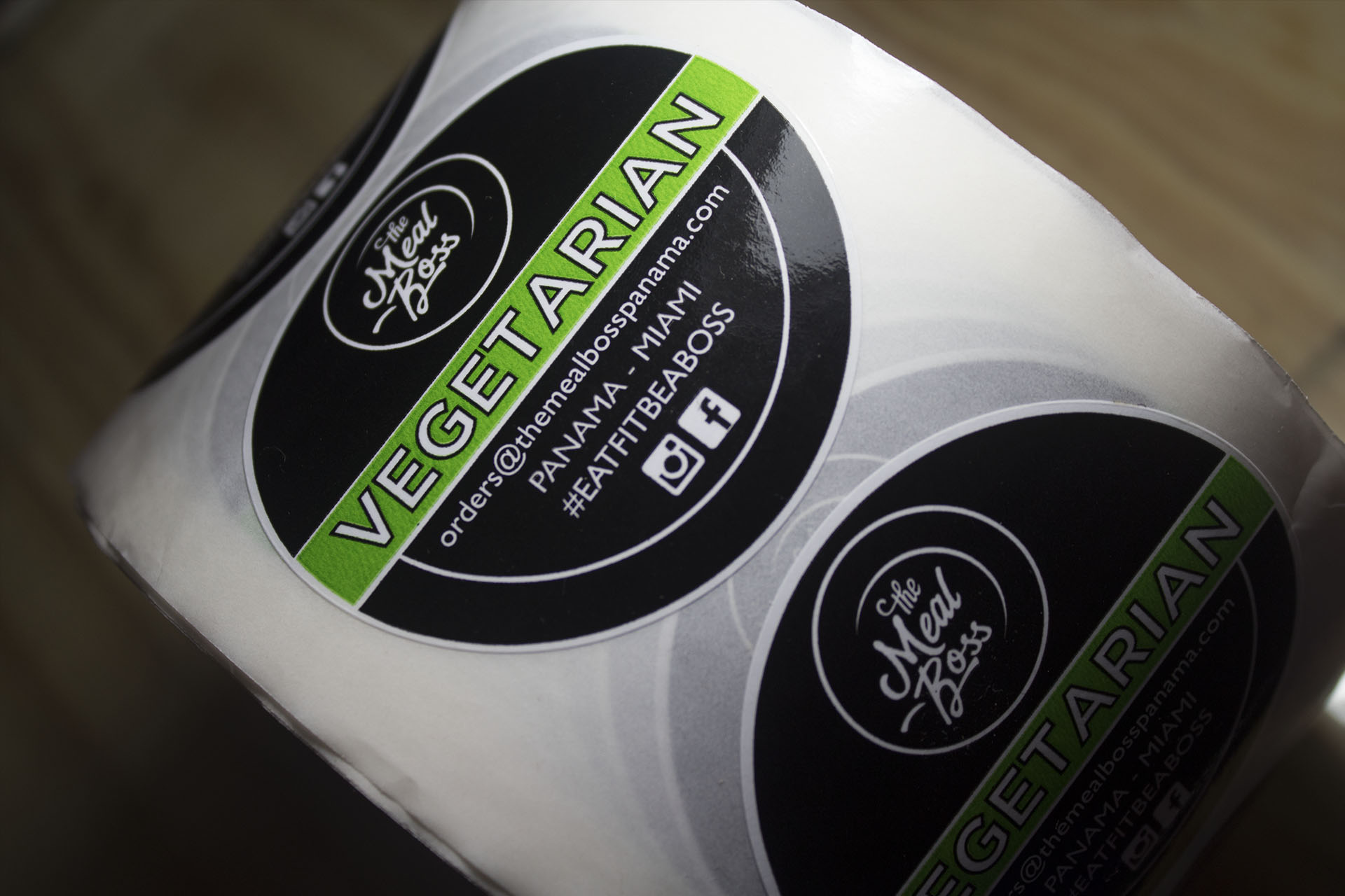
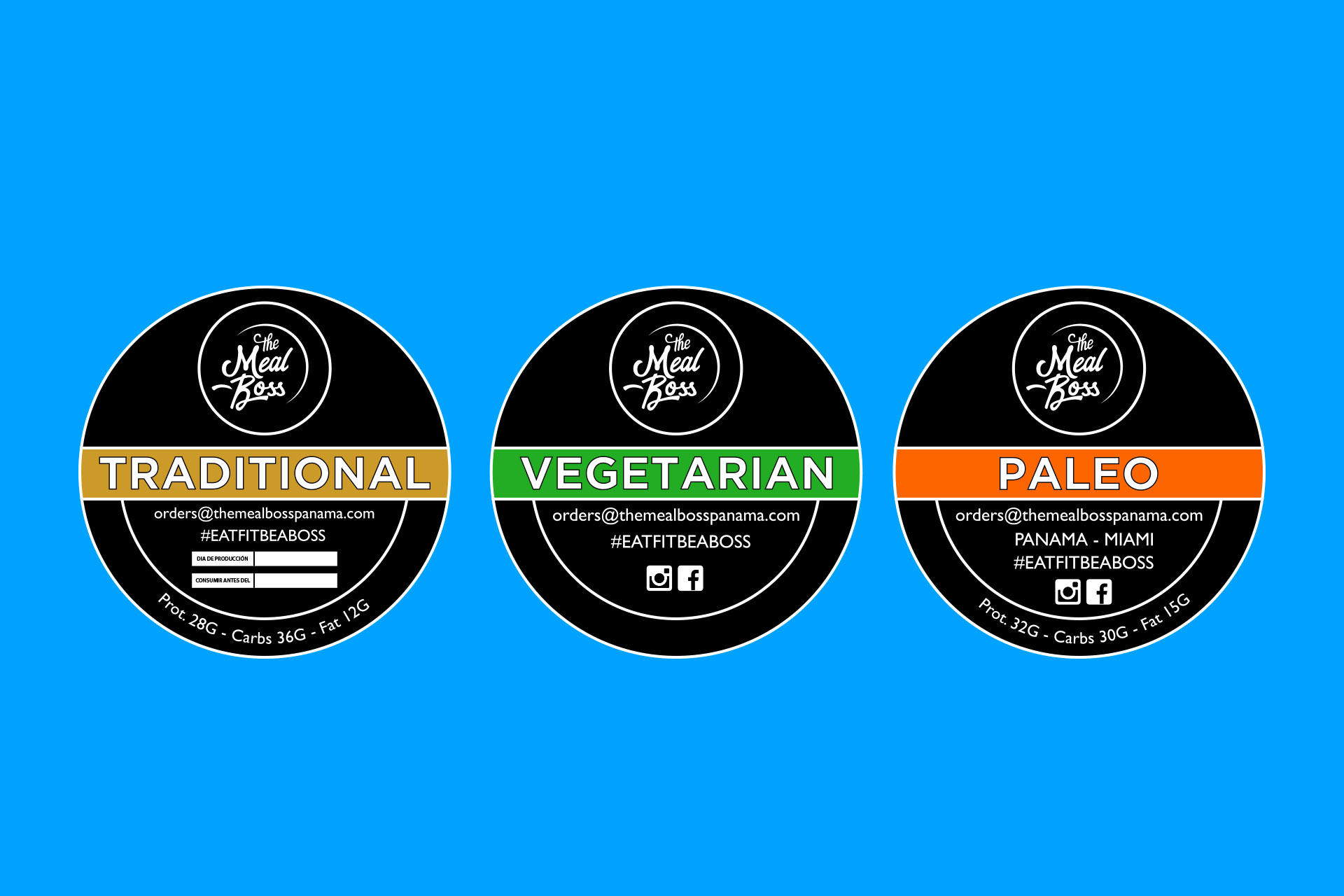
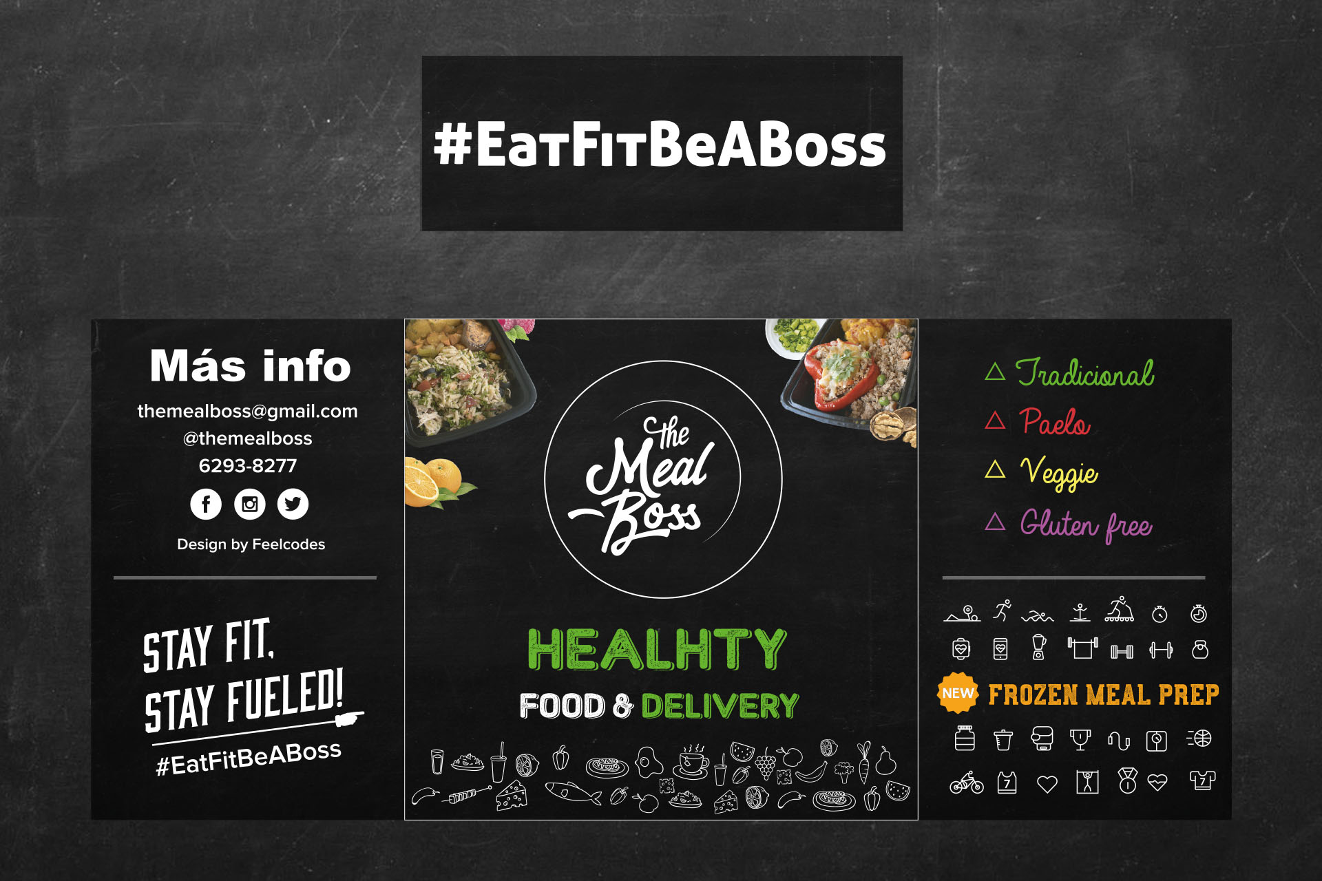
The branding began with the new visual identity of The Meal Boss, where we thought about applying the design based on the idea of a food and delivery company, we analyzed the values and attributes marked for the positioning of the brand. Lettering with graffiti style and white color on black to give exclusive touch and high class aesthetics. As new elements to the logo, the color Green, orange and red was added to convey the quality of each product of the food, separating into categories such as vegan food, Paleo and traditional style. The symbols, icons and graphic elements promote the value of the company that is reaching a physical audience and experienced in sports of all kinds. The verbal tone of the brand, has been used a cordial and affective language in which it is used in the ties of the names of motivational phrases to help start the day better for athletes and people who like to eat healthy. Our star phrase and with which the brand is identified is #eatfitbeaboss.
website designA company committed to customers to provide a healthy and nutritious food with high quality ingredients to be tested at any time.
The Result
